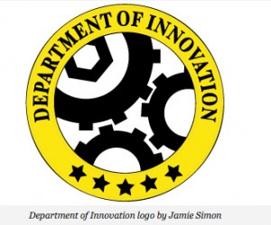
Imperfect gear – “Department of Innovation” logo fail
Posted on | August 10, 2011 |
This is quite funny. A logo fail. I did quite a handful of logos in my time (including our own leoque logo) and I am telling you, you can’t force it. Real logo, meaningful logo just comes at the right moment and without much effort. It just comes.
The Smithsonian Institute’s blog has this new section, Department of Innovation. And dealing with science and technology, it’s just right to use a “gear” on the logo right? “Gear” the most common graphic/item used in the tech or engineering industry. I am positive I used/incorporated gear back in college on some projects. So there you go, gear it was, and the D.O.I. showcased their logo and the logo is this…

gears cant spin
So I guess the Department of Innovation needs to innovate their logo some more.
Speaking of more, here’s the link of the orig story.
And, speaking of gears & college, back in school, we have this gear project (I forgot that 2nd semester subject, its been years!)… where we were tasked to create a gear from cardboard that should rotate smoothly with given problem and corresponding calculations (obviously, I also forgot the gear terms {like pitch addendum, dedendum} and the math involved).
Not to lift the chair, but I am happy to say I was the only one who submitted a perfectly running gear. :) It was made from brown card board and brown craft paper. The outside diameter was around 8 inches. The professor kept my work. And I was thinking, woah, my work shall be an example to all future engineering students of the world. Bravo! Bravo!
But some 30 minutes later, on my way to the faculty, I saw my gear hanging off the door jamb of engineering faculty room! It’s serving as their Christmas lantern! Amazing!
True story.


